How Fonts Transform Your Web Design: A Guide to Choosing the Right Typeface

Fonts are powerful tools that can either elevate your brand or muddle your message.
When designing a website, fonts make a huge impact on how your brand is perceived. Your choice of fonts plays a pivotal role in shaping the look and feel of your website.
It's not just about making words legible (which is very important); it's about conveying emotion, personality, and purpose. Fonts, or typefaces, are a cornerstone of visual communication, subtly influencing how visitors perceive your brand and interact with your content.
Today, we're diving deep into how fonts can transform your web design, focusing on popular categories like Sans Serif, Serif, Script, and Display.
Understanding the Basics: Serif vs. Sans Serif
Before we explore the diverse world of fonts, let's start with the basics. Typefaces can broadly be categorized into Serif and Sans Serif.
Serif Fonts
Serif fonts are characterized by small lines or strokes attached to the ends of letters.
Think of Times New Roman or Georgia.
These fonts are traditional and are often associated with reliability, respectability, and a sense of history.
They're excellent for body text in print, but in the digital realm, they're typically reserved for titles or areas where a touch of formality is desired.

Times New Roman - A Serif Font
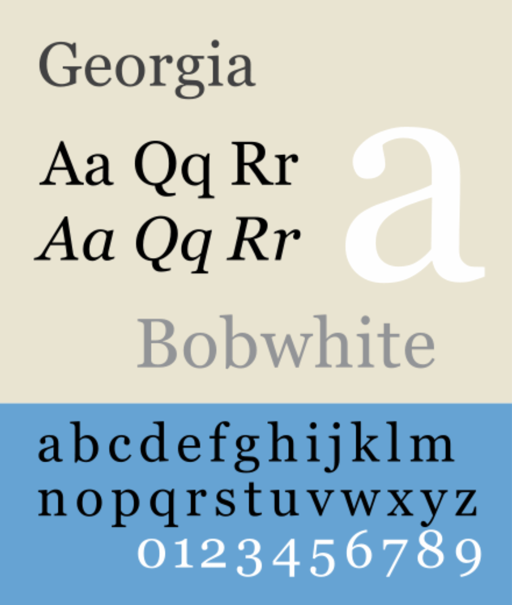
Georgia - A Serif Font
Sans Serif Fonts
Sans Serif fonts, on the other hand, lack these embellishments.
"Sans" means without in French, so these are fonts "without serifs".
Helvetica, Arial, and Google’s Roboto are prime examples. Sans Serif fonts offer a clean, modern look and are incredibly versatile. They're easier to read on screens, making them a popular choice for web and mobile interfaces.

Helvetica, Sans Serif Font
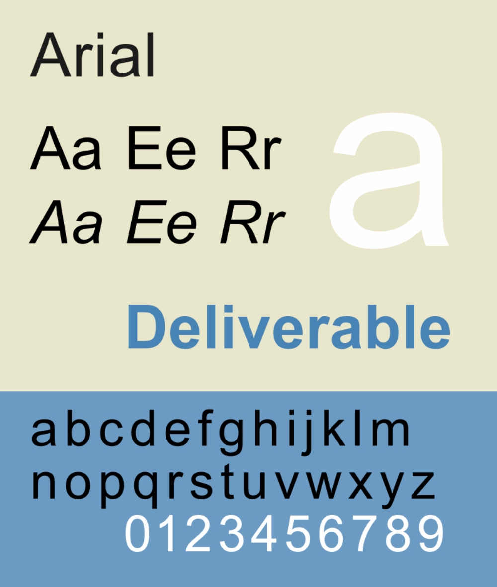
Arial, Sans Serif Font
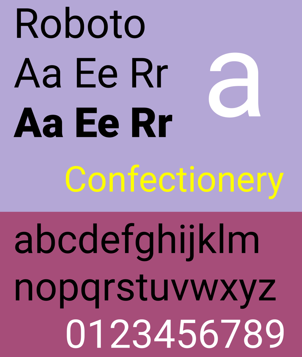
Roboto, Sans Serif Font
The Impact of Choosing Between Serif and Sans Serif
The choice between Serif and Sans Serif can significantly affect your website's vibe.
Serif fonts can add a layer of sophistication and tradition, ideal for brands that want to highlight their heritage or authority in a field.
On the other hand, Sans Serif fonts project a more straightforward, contemporary image, perfect for startups, tech companies, or any brand aiming for a fresh, approachable feel.
Exploring the Elegance of Script Fonts
Moving beyond the Serif and Sans Serif dichotomy, Script fonts mimic the fluidity of handwriting, ranging from elegant calligraphic styles to casual, handwritten looks. Script fonts like Lucida Handwriting and Brush Script add a personal touch to your design, conveying creativity, elegance, or warmth, depending on the style chosen.
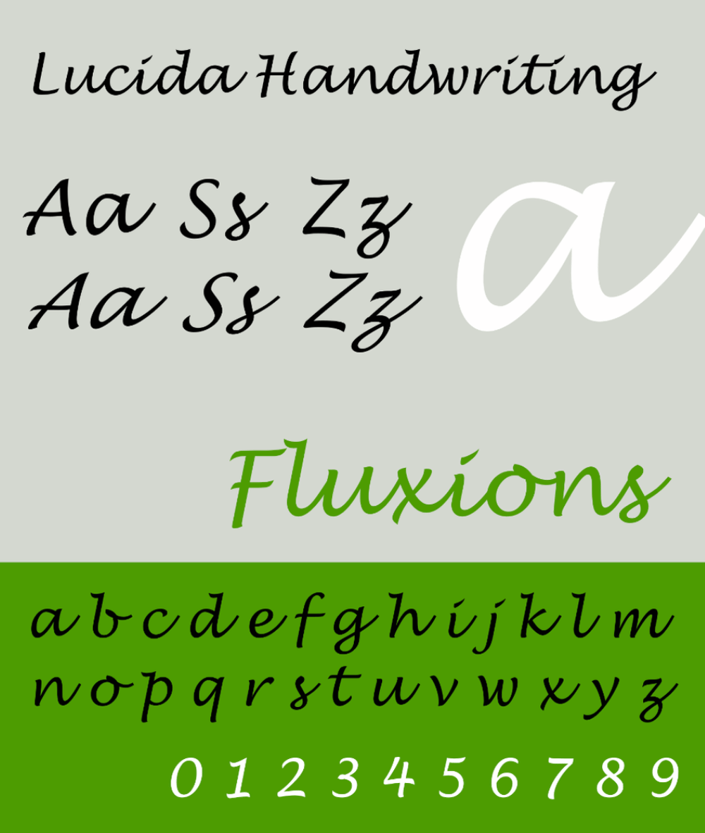
Lucida Handwriting, Script Font
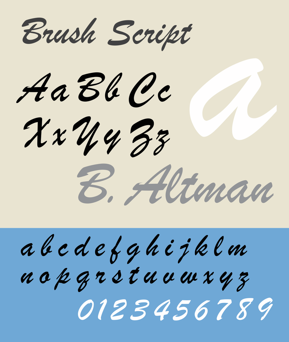
Brush Script, Script Font
However, Script fonts come with a word of caution: they're best used sparingly.
Due to their intricate details and variability, they can be challenging to read, especially at smaller sizes or in long text blocks. Consider using Script fonts for logos, headings, or special highlights where their artistic flair can shine without compromising usability.
The Versatility and Charm of Display Fonts
Display fonts are the rebels of the typography world. These are your go-to for making a statement. They're designed to grab attention, often featuring unique characteristics, such as unusual shapes, outlines, or even thematic elements that relate to your brand (think fonts that look like they're made of wood for a carpentry website).
The key to using Display fonts effectively is moderation and context. They can make your headings and titles pop, but they're not suitable for body text. Pair them with more readable fonts for most of your content to maintain balance and ensure your message is accessible.
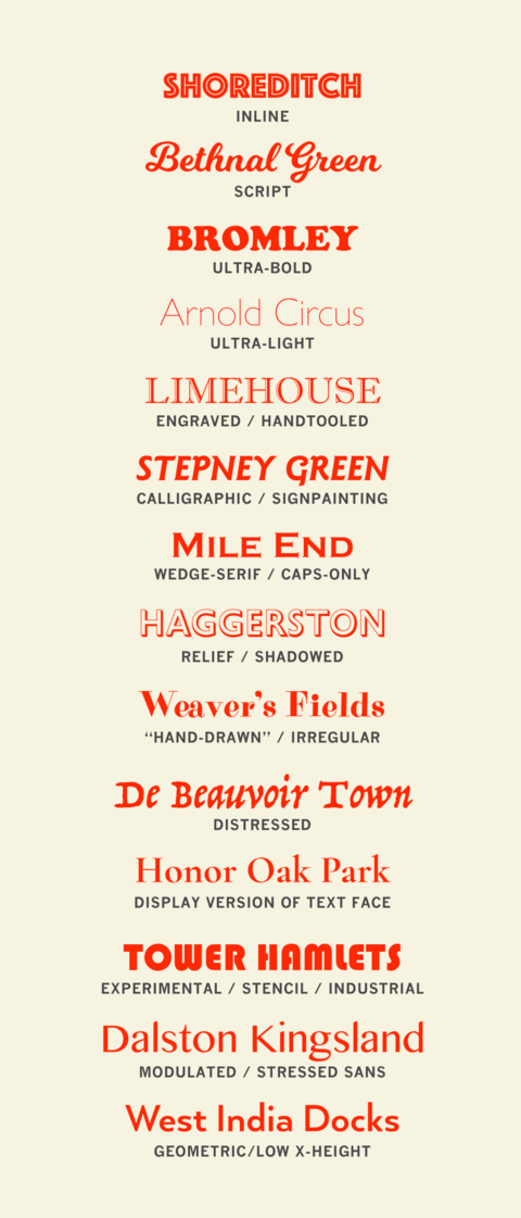
Various Display Fonts
Making Smart Font Choices for Your Website
Choosing the right font is about more than just aesthetics; it's about functionality and user experience.
Here are some tips for making smart font choices in your web design:
Consider readability
Above all, your website's text should be easy to read. This means opting for larger font sizes, especially for body text, and high contrast between the text and background colors. If it doesn’t look crisp and easily legible, ditch it.
Font readability is crucial in ensuring that your message is seen, understood, and absorbed by your audience.
A highly readable font is clear, uncluttered, and easy on the eyes, facilitating effortless reading across various platforms and devices.
With their clean lines and absence of decorative flourishes, Sans Serif fonts are often lauded for their readability, especially in digital contexts where screen glare can impede legibility. The size, color contrast, and spacing of letters (kerning) and lines (leading) also significantly enhance readability.
Choosing the right font and fine-tuning these elements can drastically reduce reading fatigue, ensuring your content is accessible to everyone, including individuals with visual impairments or reading difficulties.
By prioritizing readability in your font selection, you make your content more inclusive and reinforce your message's effectiveness and impact.
Match the font to your brand personality
Your font choice should reflect your brand's identity. A tech startup might lean towards clean, Sans Serif fonts, while a boutique bakery might opt for a more decorative Script font for its headings. Choosing the right font is like selecting the perfect outfit for your brand's personality—it communicates who you are without saying a word.
For the bold and adventurous brand, a strong, impactful Display font can convey confidence and innovation.
If your brand leans towards elegance and sophistication, a refined Serif or a delicate Script font adds a touch of class and exclusivity.
For the modern, minimalistic brand, a clean and straightforward Sans Serif font speaks volumes of your sleek and efficient approach.
Meanwhile, quirky and creative brands might opt for a unique Handwritten font that showcases their individuality and approachability.
Each font carries its own weight and character, making it crucial to match your choice with the personality you want your brand to project, ensuring that your visual communication resonates deeply with your intended audience.
Limit the number of fonts
Too many different fonts can create a cluttered look and confuse your brand message.
Limiting the number of fonts on your website is essential for maintaining a clean, cohesive, and professional appearance. A standard recommendation is to use no more than two or three different fonts.
This restraint helps establish a clear hierarchy and consistency across your web pages, making it easier for users to navigate and process information.
Using too many fonts can:
lead to visual clutter
distract from your content
confuse your brand's message
Each additional font can increase your website's load time, potentially harming your site's performance and user experience.
By carefully selecting a few versatile fonts that align with your brand identity and serve distinct purposes (such as one for headings and another for body text), you can create a visually appealing design that enhances readability and reinforces your brand's voice.
Test on different devices and browsers
Ensure your chosen fonts display well across various devices and browsers. What looks good on a desktop may not translate well to mobile screens, and most people view your website on a mobile screen.
Fonts may display differently on different screen sizes, resolutions, and operating systems, potentially affecting your site's readability and overall aesthetic.
What looks impeccable on a desktop browser might not render as well on a mobile device or an alternative web browser, leading to misaligned text, unexpected font substitutions, or layout breakages. You can identify and address inconsistencies or performance issues by rigorously testing your chosen fonts across various platforms—from the latest smartphones to older desktop computers- and popular browsers like Chrome, Firefox, and Safari.
This proactive approach ensures that every user, regardless of how they access your site, enjoys a visually appealing and functionally seamless experience, reinforcing your brand's professionalism and attention to detail.
Be mindful of load times
Some fonts, especially those with many details or variations, can slow your website's load times. Opt for web-optimized fonts and consider using font-display techniques to ensure text is visible even if the font hasn't fully loaded yet.
The fonts you choose can significantly influence your website's look, feel, and functionality.
While custom fonts can significantly improve your site's aesthetics and brand identity, they can also increase page load times, especially if you use multiple font weights or styles. Slow-loading fonts can delay text rendering, potentially causing visitors to leave before the content fully appears.
To mitigate this, consider using web-optimized fonts, limiting the number of font variations (weights, styles) you include, and leveraging modern web technologies such as font-display swap in CSS.
This approach ensures text is visible with a default font while the custom font loads, improving perceived performance. By prioritizing font load efficiency, you can maintain your site's visual appeal without sacrificing speed, keeping your audience engaged and reducing bounce rates.
Fonts Matter
Whether you opt for the clean lines of Sans Serif fonts, the elegance of Script fonts, or the boldness of Display fonts, remember that your ultimate goal is communicating effectively with your audience.
By understanding the nuances of different font categories and following best practices for font selection, you can enhance your web design and create a memorable, engaging online presence for your brand.
Your choice of font is not just a matter of style—it's a strategic decision that affects user experience, brand perception, and even the success of your online endeavors.
Do you have questions about fonts?
Do you have favorite fonts that you love to use?
Share below!
Let’s talk fonts!